


 1 / 5
1 / 5

ON FRIDAY
FEBRUARY 5, 2016
Email your feedback and
queries to: propertyqs@
thesundaily.comX
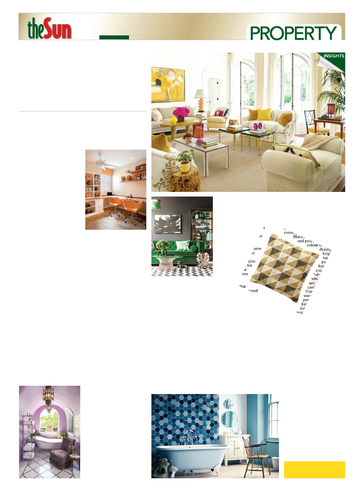
ORANGE
Orange is a fun and energetic
colour that combines the passion of
red and the cheeriness of yellow. It
is amoremodern and a great colour
for the house, whichmakes it an
unconventional choice for many
people.
In deeper tones, it is better to
use orange as an accent colour for
rugs, chairs and lampshades in this
shade. Orange is also creditedwith
improving lung function and
increased energy, while exuding an
atmosphere of happiness – ideal for
living areas around the home.
Lighter tones of orange have a
higher yellowpercentage, which is
a good choice as wall paint for
places like the home office or the
workout room. Avoid orange in
bedrooms, as it has a similar effect
as red.
YELLOW
The colour yellow almost instantly
ignites amore cheerful and happy
atmosphere to any space. It can
inspire conversation and bring back
happymemories. If a roomhas a
purpose along the lines of evoking
optimism, cheerfulness, energy and
positivity, then yellow is a suitable
choice.
Deeper tones of yellow is said to
stimulate intellect, which is well
suited for rooms where work is
done, while lighter tones work
better in living rooms as it can
stimulate relaxation.
Yellowdraws in natural light,
while also increasing one’s appetite,
whichmakes it a good choice for
kitchens and dining rooms too.
However, avoid yellowwalls for
bedrooms, as it is another high-
energy colour like red and orange
andwill not helpwhere shut-eye is
concerned.
GREEN
Green is a colour of coolness, calm
and positivity, as it is often
associatedwith nature. The
combination of the coolness of blue
and the cheeriness of yellowmakes
green promote harmony and
balance. Darker tones of green
“high energy” colour and can prove
disruptive for one who needs a
good night’s rest. Instead, opt for
red as an accent colour in the
bedroom, showing hints of the tint
in your curtains, blinds, bed linen
or furniture.
BY
ALYSSA J OON
C
OLOURS
are a
communicative language.
In fact, one is able to
convey a number of
emotions with just one colour. In
addition, the effects a colour can
have on a person can cause a
physical or emotional change.
LANGUAGE OF
COLOURS
Colours can be broken down into
two types, which are warmor cool.
Warmcolours include shades like
red, orange, yellow and all the
different combinations that involve
these three hues. The physical
effects that warmcolours have on a
person include increased heart rate
and blood pressure and heavier
respiration. Warmcolours also
have an “advancing” effect, which
is why it is better suited to larger
rooms for a cosier feel.
Green, blue, purple and its
various combinations are
categorised as cool colours. These
shades havemore emotional effects
on people, such as feelings of cool
and calm, and sometimes even
moodiness. However, cool colours
are good for smaller rooms as they
have a “receding” effect that makes
the room lookmore spacious.
Neutrals on the other hand are
trickier to peg, due to its conflicting
nature. Black andwhite, for
example, are colours that bring
different meanings in different
parts of the world, while grey can
be elegant if in a lighter shade, but
depressing in a darker tone.
Nevertheless, it is essential to
understand the effects, whether
physical or emotional, that colours
have on a person before deciding
the shade to pick out for a fresh
coat of paint for various parts of the
home.
RED
Red is themost powerful colour,
and is associatedwith passion,
danger and life. Deeper tones of red
stimulate sensuality, while lighter
shades evoke friendliness and
warmth.
Red is commonly used in
kitchens and dining rooms, as it
increases one’s appetite. Best to
avoid using it in bedrooms as it is a
Express it
with
c
o
l
o
u
r
s
>Colours havepsychological effects that one
shouldusewith care
NEUTRALS
Known as the tricky bunch, the
effect these tones have on one’s
mood can affect a person. No
matter the culture or belief that
corresponds with each of these
neutral shades, when a colour with
the right shade is selected, it can
evoke positive vibes.
Black is seen as sophisticated
and powerful. It is a good
colour to use when
dealing with
bright,
sugary
pastels in the
house. It is a
colour that can
“absorb” the light,
which is why it is
not advisable to be
used as a base colour.
Use black the way one
uses the black colour
pencil back in
kindergarten - to outline
instead of colouring it in
as an overpowering amount of
black can induce depression.
Whites are understood as pure,
innocent and clean. It is a common
colour that is found in most Asian
homes especially. Due to its clean
and crisp nature, white is
commonly used because it makes a
room look much brighter and
bigger. There are not much
negative aspects to using white,
but be a little bolder by going for
slightly off-white colours for that
new paint job.
Commonly overlooked and
misunderstood is the colour grey
because it is seen as depressing.
With its mix of the sophisticated
black and the clean nature of
white, grey in lighter tones is a
refreshing new take and a great
choice as wall paints. Lighter tones
of grey also help create an air of
calm and understated confidence.
It is a good colour for drawing
attention to the fine features and
details in a room.
With the Chinese NewYear just
around the corner, a new coat of
paint could be the right way to
celebrate the festive occasion. As
the right colours will set the tone
for the rest of the year, be sure to
pick a good one that leaves a trail
of positive notes and vibes.
well with lighter shades of blue as
the colour is usually associated
withwater, which is calming and
comforting. Selecting light shades
of blue for a bathroomcan turn it
into amini paradise.
In living rooms, where
“extroverted” items such as
televisions are placed,
providing a corner of blue
will serve as an
“introverted zone” for
time-out moments where
peace and quiescence
are needed.
Dark blues are also
fantastic colours for
bedrooms, as the
deep tone creates
a calmand
relaxing
atmosphere that
sets just the right mood
for restful sleep.
PURPLE
Purple is the colour of royalty,
luxury, the rich andwealthy. Purple
also evokes creativity, serenity and
thoughtfulness, and is closely
associatedwith religious matters in
various cultures.
With the combination of
passionate red and calming blue,
purple is an unconventional choice
for a couple’s bedroom. Aword of
caution though - go for purples that
are closer to the bluish spectrum
rather than red, as it can be too
dominating andwill lose its
majestic feel.
Feng shui principles also advise
against using toomuch purple as it
has “strong vibrations”. Instead, use
purple sparingly and in accent
pieces in the house.
however, are known as a stimulant
of verbal wit and critical analysis,
while lighter tones can inspire
confidence. Emerald greenwhich is
a darker shade of green exudes
luxury and comfort. It is well-suited
for bedrooms and living rooms
where relaxation takes place
whereas brighter tones of green
such as lime green is more suitable
for places of work and play, due to
its energetic nature.
BLUE
A colour that expresses melancholy
is blue. It is calming, relaxing and
versatile and known to evoke
wisdom, tranquillity and clarity,
communicating professionalism
and trustworthiness.
A versatile colour with its array
of shades and hues, take note that
every blue has a psychological
effect so, think twice before
applying any shade to a room.
Bathrooms, for example, will work
PHOTO/WWW.DECOIST.COM
PHOTO/WWW.PHOTOSHGTV.COM
PHOTO/WWW.HOUSEBEAUTIFUL.COM
PHOTO/WWW.INTERIORSBYSTUDIOM.COM
PHOTO/WWW.SGOMARKETING.COM