


 1 / 5
1 / 5

decoration on the dining table or
console by the entrance. Stringing
pendant lights are a funway to
light up the home using natural
textures that fit right into a coastal-
inspired home. Rugs are also a great
way to define space in an open-plan
home. Often seen are flat-woven
rugs that blend inwith the coastal
theme, often found in ocean-
inspired homes painted blue or in
natural hues.
emanating the
same positive vibes
and feel among the
occupants.
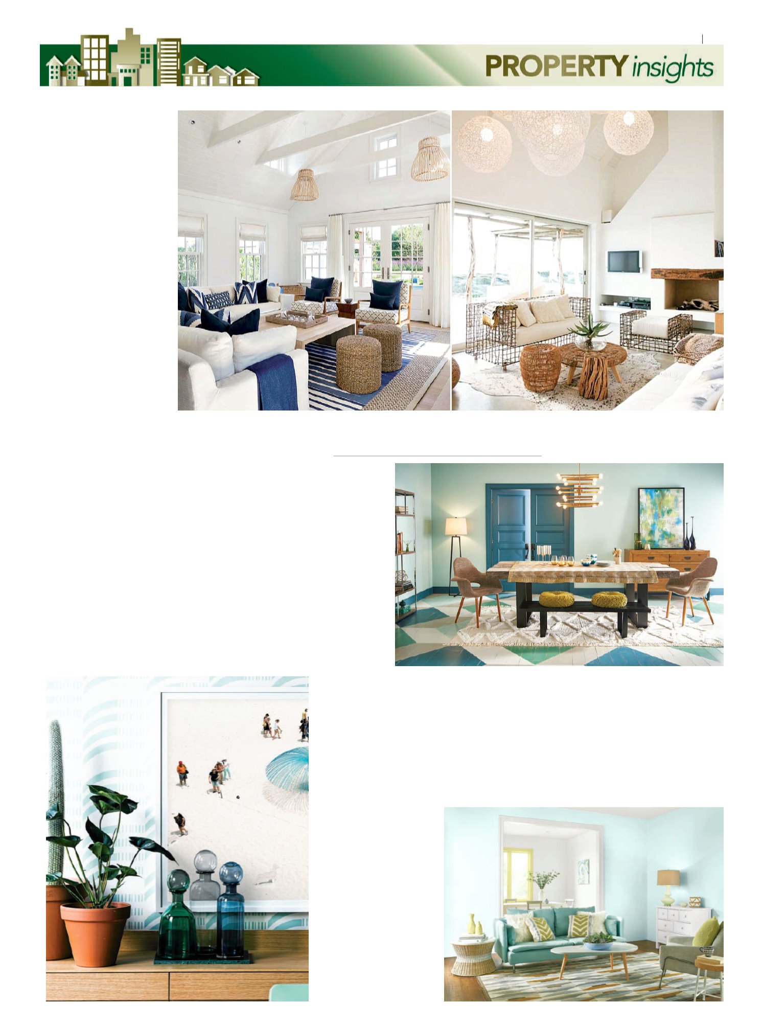
COASTAL
DREAM
It may come across
as a little odd for a
country like
Malaysia, with our
white sandy
beaches and easy-
to-reach beaches
that sea-front
homes are not a
trend. Houses that
face the sea usually
take inspiration
fromnatural
colours andmore
often than not, take
in textures of the
beach into the
home. Most importantly, these sea-
front homes are the perfect place to
escape to, especially when city life
gets a little too hectic.
While somemay claim that it is
the sound of the waves that attract a
calm, there is no denying that
beach-inspired homes are
commonly uncluttered or
distressed, wear white shiplap
walls, while other homes don light
shades of blue or plain-white wall
paint. Whether plainwhite or light,
both give the home the same airy,
open feel of the beach. Match
these “innocent” shades with
large white-panelledwindows
along with glass doors to allow
sunlight to stream in, and you get
yourself that sun-on-your-skin
feeling indoors as well as out.
Natural textures are abundant
withinmost homes. Kitchen
countertops and cabinets, dining
tables and coffee tables in light
or honey-huedwood add a touch
of raw yet warmth to an
otherwise sterile white room.
Alternatively, look for wooden
furniture pieces in reclaimed
wood, ideal for a rustic look.
Large picnic baskets, which are
reminiscent of summer picnics
can also be used as storage bins
to go under beds, on the the side
of settees on the floor or on
shelves and at patios.
P
ANTONE,
renowned
authority on colour,
recently collaboratedwith a
popular British tea brand, to
develop a new colour reminiscent
of the naturally-occurring blues
found in nature. They named the
colour “Natural Optimism”.
Natural Optimism is described
as “an airy andweightless blue
shade with an undertone of sunny
yellowwarmth that uniquely
conveys this feeling of delight”,
explains Pantone Colour Institute
vice-president Laurie Pressman.
Psychologically, blue has long
been associatedwith confidence,
serenity, spirituality and peace. An
inaccurate balance of blues
however, can have a more negative
effect on our emotions – hence the
saying “feeling blue”. Bringing in
the right blue tones, or some at least
into the home or office, is said to be
able to help us find calm amid the
chaos that is part and parcel of life
and the world around us.
THE RIGHT BLUES
According to architectural paint
and exterior wood care products
supplier Behr, there are three
palette types for paint, which are
“Confident, Composed and
Comfortable”. Each palette serves
as a guide for homeowners of
varying personalities. In their
prediction of paint colours in trend
for 2017, various shades of blue pop
up in each of the three palettes.
Confident Dusky Blue
In the Confident palette there is
“Dusky Blue”, a saturated and bright
colour that captures attention and
enlivens spaces. For a sporty edge, it
is recommended to be pairedwith
dark greys on anchor pieces of
furniture such as the bed, thrown in
with bright orange and spicy red
accents. For an element of fun and
adventure, Behr suggests using
citrus-toned yellow and orange
accents instead.
Composed Polished Aqua
The Composed palette on the other
hand is made up of deep, earthy
tones and rich jewel shades that are
evocative of traditional grandeur.
Still, these can be given a
contemporary touchwhen paired
> Putting calm into the home space
with greys, black or white. Behr
uses “Polished Aqua” for a dining
room’s walls, pairing it with natural
wood andmetal accents throughout
the room. A dark blue entryway
complemented the colour and
proved that multiple shades of blue
can dress the walls of a room
without being too overwhelming.
Comfy Peek-a-Blue
Last, but not the least is Behr’s
Comfortable palette featuring the
ideal colours for a soft and tranquil
look, perfect for small spaces and
rooms withminimal lighting. With a
light blue like “Peek-a-Blue”, neutral
hues on the floor and furniture
easilymake the walls the focal point
of the room. Andwhen pairedwith
bright accents of yellow, orange or
bold green, a light blue-walled room
is given a boost of energy, subtly
Use pastel or neutral colours on
furniture pieces to complement the
white or blue walls. Sofas with
pleated skirts are a favourite in
coastal-inspired homes. For a more
Malaysian touch, the writer
suggests getting armchairs made of
rattan and using cushions in tropical
prints or pastel hues.
For finishing touches, bring in
leafy plants to freshen up the air
indoors. Create centrepieces with
glass vases filledwith sand and
seashells, whichmake perfect
Home ... aplace
of
retreat
BY
ALYSSA J. OON
WWW.HOMESTOLOVE.COM.AU
NEWSROOM.BEHR.COM
HANLEYDEVELOPMENT.COM WWW.HARPERSBAZAAR.COMNEWSROOM.BEHR.COM
CONTINUEDON
NEXT PAGE
X
19
theSun ON FRIDAY
|
JUNE 2, 2017